FAILLL i'm sorrry ok here we go: 10's for June..
Elle Perez + Paolo Morales
Showing posts with label critique. Show all posts
Monday, June 15, 2009
Friday, April 24, 2009
RE Elle's Five 4.19.09
I like the one of your dad--the facial expression is and angle of the face. He's also not looking straight at the road, he is looking at an angle.
The 6th image of your mother is great. POV glorifies her. Maybe take a step back a foot or two to get the whole door and the feet in the frame?
The last image is my favorite. I like the lines and shapes, especially the way the lines on the bottom half of the frame leads your eye into the center. I'm not sure if this image is about form or if its documenting a space, which could be a floor or a ceiling? Not entirely sure but that is what makes the picture interesting.
Tuesday, April 14, 2009
RE Elle's Fives 4.12.09 / BXUNG Details
In terms of the series, I'm responding to the first two images in your five. Maybe I laugh at the third because I was there...? And I love the last one. Its documentary in nature. And the gesture of that second hand coming in is great. The viewer doesn't necessarily know who it is. Is it a loving gesture? A "here let me see"? Or is it a "here let me a take a picture"?
The detail shots intrigue me. They remind me very much of survellliance. But they are more moment images (ex: 2/5.) Is the first image of one of those things people put in their ears to make them bigger? Its considered with shape and form. Love it. The gestures in the third and final image are pretty great. Notions of intimacy in the first and adolesence into adulthood in the second. The cigarette juxtaposed with the different colored nails is really wonderful.
Tuesday, April 7, 2009
Re: paolo fives 4/6/2009
These are emily, correct?
Responding to:
The one of her on the tree stump, the art gallery portrait (she looks like she jumped out of a portrait painting) and the one between the two columns. While I don't really like what she's wearing (it feels more like a style blog shot than a portrait of her... ) I like your framing.
Monday, April 6, 2009
RE Sunday Fives 4.5.09
I'm most interested in the third image of the girl and two boys. Maybe I'm spending too much time looking at painting but I think of Madonna and Child..
I like the one of your mother. Her facial expression is intense. Your choice of natural light idealizes her. Especially with the harmonizing colors of her clothing and the room.
Good stuff, Elle.
P
Monday, March 16, 2009
RE Girl World Variations
I think this new way of executing the project is rather successful. Eyes, mouth and almost any facial feature that makes people physically unique is irrelevant in your thesis, which from my understanding is to look at the ways toy figures are leading young children (boys and girls) to believe there is a standard that must be adhered to if he or she is to be "perfect" and maybe even "ideal."
The adage "less is more" works very nicely here. You provide the audience with as little information as possible with the exception of a few signifiers that would suggest that these are over-polished toy dolls. Which brings me to the rips on the edges. I understand your reasoning for it. Is there another way you could insinuate that these are toy-esque? What if you did the bold/emboss to make it look like it was a plastic box for instance.
Also little technical things.... please don't cut off the hands/fingers! I think they're important. No?
Cannot wait to see more!
Friday, November 14, 2008
RE "The Best Years"
Okay, you have way too much work here to bypass a crit. :)
I will comment from the top most image down to the bottom.
Title: "The Best Years of Our Lives" (?)
I was recently in a photography lecture noting that the cover of books/portfolios is 75% of what sells books and makes audiences want to pick it up. Does the pretty image of a college campus draw in the viewer to world filled with alcohol equivelants to work loads? I don't know, but maybe you want to think about that a little. I am not suggesting that the cover doesn't draw the viewer in, but I'd encourage you to question it.
1st image: this is the most successful of your beer pong images. You have a character texting/BBM-ing, something that is so common in these types of settings. The viewer also has some mystery. Who is this guy? Is he a straight edge kid? He doesn't have a cup in hand. Is he texting for someone to pick him up because he's too drunk or is he checking to see what else is going on that night?
2nd/3rd: The 3rd image is the better pick of the two. Is she smiling innocently with a beer in hand, seconds after she hooked up with the boy who's hiding behind her? The 3rd has more of an implied story/mystery than the second. I don't know enough in the 2nd to come up with something.
4th: Secrets? Lying? Backstabbing? All the drama associated with partying and college are in this image, as well as layers of characters. Is she whispering about the viewer? I love that she's looking at us, making the audience a player in this story line, too.
5th: I like this image. It focuses more on the idea of texting/technology and constant communication within the party context. I like that this focuses on this specific trait of college/partying/being a part of this generation. I think I would keep it even with the 1st image.
6/7: Story? I don't feel like I'm learning anything about the characters or context of the situation.
8th: I like the piggyback ride. Is it flirtateous or is he trying to carry home a very drunk friend?
9th: Again, I love that you're bringing in the viewer into the situation. We said you would continue to shoot like this I believe. I like this image a lot.
10th: Distance/seperation! There is the mystery of the cropping of the heads. The boy is probably attracted to the girl, he leans forward and the girl just sits back holding a beer. Is she being resistant? Or is she is waiting for the guy who's beer comes into the frame as he "cock blocks" the boy who is leaning forward? Great story in this image.
11th: The 9th is the better frame. This is too in-between moments to pick up on something. And the technology/cell phone story is already taken care of in the previous two images.
12th: Tina Barney? Nice lighitng. Good layering of the subjects. Is the girl thinking about the paper she has to write that is due in 48 hours or is she just trying to relax and drink her wine? The boy in the back is great, leaning against the wall. Perhaps he's too drunk to even stand straight...
13/14/16: You have better beer pong images which I commented on in the beginning.
15: You're doing mostly horizontals but this is a nice vertical. She's trying to appear chic/classy holding a glass of champagne but the snapshots in the background beg to differ. The scotch-taped pictures to the wall are out of context, almost child-like.
I love it, Elle. Happy shooting!
Labels:
collegeproject,
critique,
editing,
Paolo
Friday, October 17, 2008
RE College
I like where you are going in these images.

1st image: We've discussed the "object" portrait a few times if I recall. I like this one, more so because its in the context of a documentary versus a portrait. I also enjoy the dividing line of the wood.
2nd image: That's a really strong image. Mixing pain killers with a drink (?). I don't know what is in that glass exactly. Is it a glass of coca cola or a glass of wine? I love the picture but I would love it more if I saw some red or white liquid to suggest wine of some sort. But then again, I don't know, maybe the glass is enough of a signifier to tell the story...
3rd image: I think this is a beautiful picture. Kind of Philip-Lorca DiCorcia:

My issue is I don't know what is going on in the image. Two characters are in a car. The light is strong, like DiCorcia's image is. Are the two girls heading off to a party? Or are they simply in the midst of a conversation?
4th image: Again, gorgeous. The angle glorifies the alcohol, "I need this to do well in school." And, like you once described this project to me, the image gives the viewer the "party hard" aspect to this project wonderfully.
5th image: Two characters are in conversation. The girl to the left is clearly all ears to the girl on the right. Are they discussing their boy-problems? Their "horrible" B+ in French class? Or are they debating over what Tolstoy is trying to say in War & Peace? I'm not sure what is happening in this image, but I like it better than the 3rd.
How are you lighting these? Are you mounting strobes? The lighting is strong, more polished than Lauren Greenfield. And I don't know if I agree with the Greenfield reference... I'm seeing more Bruce Davidson ("Brooklyn Gang"), Larry Clark ("Teenage Lust"), or Colin LaFleche ("Right After").
Nice beginning, Elle. I can't wait to see more.
Labels:
collegeproject,
critique,
girls,
Paolo,
portrait
Saturday, October 4, 2008
re: women interest
Ok. I know you are still in "figuring it out" mode but here's what I think - I think that you might actually need to be writing instead of photographing. .. not that you shouldn't photograph also, but you know what I mean.
You know how you told me to write a list? YOU write a list!
it doesn't have to be very long to click... here's a scan of me figuring out my next project in class:

also, i really like the idea of you taking the self portraits out of your hands and putting the power into other people's hands. Are you going to continue more with that project? I think you should. Kind of like a.."how do other people see me" project. Maybe I need to do that project. Because I'm really fucking short sighted these days.
Also, what kind of questions are these creating for you? Yes, you are fundamentally interested in women. So are most guys. What makes you different, where is your interest coming from, what are you interested in, what do you associate women with?
Because right now all these images are doing is objectifying girls you kinda know. So. "Why do you care about this"?
You know how you told me to write a list? YOU write a list!
it doesn't have to be very long to click... here's a scan of me figuring out my next project in class:


also, i really like the idea of you taking the self portraits out of your hands and putting the power into other people's hands. Are you going to continue more with that project? I think you should. Kind of like a.."how do other people see me" project. Maybe I need to do that project. Because I'm really fucking short sighted these days.
Also, what kind of questions are these creating for you? Yes, you are fundamentally interested in women. So are most guys. What makes you different, where is your interest coming from, what are you interested in, what do you associate women with?
Because right now all these images are doing is objectifying girls you kinda know. So. "Why do you care about this"?
Labels:
critique,
elle,
girl-friends,
Paolo
Thursday, October 2, 2008
RE Sketchbook Pages
I like that the image/photo-montage is balanced. No element stands out in particular. The colors work in harmony, making each part have equal importance.
I'm having trouble interpreting this work, partly because I never fully understood photo montage (even from the Surrealist point of view) and partly because I can't make out any narrative. But I don't think you want me to. Are you putting together images based on color theory? Or are you trying to make a montage layered with symbols and metaphors?
Monday, September 8, 2008
RE Natasha/Notes
*Natasha
I initially tried the technique of covering up one photo and seeing how I felt about it. On their own, I feel like I'm looking at an outtake. As a dyptich, I really like what is happening. There is an awkwardness and discomfort in Natasha that stays consistent in the two frames. These aren't out takes of some pretty girl who forgot to strike a pose for a frame, this is how Natasha really is. She gazes out, lips pursed, almost smiling, maybe attempting to see if that special someone finally noticed them. Or is she simply in that stage of innonence and confidence--Natasha's pose and gaze in the left frame suggest self-assurance, maybe asking "whattt are you loooooking at? (insert girly voice)" but at the same time the resting of her lips and showing of braces contradicts her confident attitude. But wait, is it only the face that tells the story? No way! Look at her sunglasses. They're oversized, white, and dark. Natasha accessorizes it with a red ribbon, clearly matched with her oversized red necklace and red bag. She sports the classic red and blue look with the trendy fitted t-shirt from Urban Outfitters: a penguin with a, wait for it, red heart. Our friend Natasha obviously cares about what others think about her. Confident? Maybe. From this dyptich, it seems to me she is that girl who is self-conscious, insecure, and cares what her friends think about her, even if she denies it.
It's also important to respond to the fact that this is the first dyptich I'm seeing in this project. How will this correlate to the other characters you're building? Why is it Natasha that gets a dyptich? Does Kate get a dyptich, too? I like what you're doing in this portrait but I'd consider how much it stands out.
*Notes
I still don't understand why you need an 18mm lens. I feel like the normal 50mm should cover you. 18mm is rather wide. It will create more physical distance in your images. Does Ryan McGinley walk far away when shooting? Does Nan Goldin? Not in the work I've seen at least. Part of their success is dictated by how close they're are getting. I think you're gaining intimacy with your subjects. And even though they don't know how wide your lens it, the images themselves might appear too distanced.
The double exposures are a must. You produced some amazing images with Kate. Let's see more of that. And yes, go for the strobe light. The on-camera flash isn't powerful enough and can't be manipulated like a strobe can.
I like the 35mm format. I don't see any reason to switch to the Hasselblad while shooting on location. The spotaneity and movement that the 35mm allows you to do works in your favor--you, as the photographer, can move around as much as you please and don't have to ask your subjects to "hold still" while you fiddle with the Hasselblad. The 35mm allows you to just watch the moments and snap away.
Labels:
critique,
Girl Punk Portraits,
nashi,
Paolo
Wednesday, August 27, 2008
Re: Waiting.
So, sorry I left your crits unattended for so long. Pre-Orientation has been so busy I can barely have time to think, let alone process.
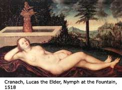
You know what I find interesting about this image? That you seem to almost be taking the position of the "reclining nude". Typically, we see this as a female, sans clothes, passive, beautiful, and ready to be an object of lust, affection, desire or whatever else you want her to be.
But you're not nude, your not female. I also think that the red was an interesting choice because Red is such a lustful color. What are you saying to the viewer with your body language? (That you are passive, yet seeking - obviously Franny's - lust?) You give the viewer full view, don't confront the viewer with your gaze, and seem ready to be used as an object for whatever Franny desires. If she calls, at all. Which is what you're waiting for.
We usually don't see a male character in a passive pose, or if we do, it's layered with irony and usually done as very tongue-in-cheek. This doesn't feel that way to me. I feel as though you really, truly, let down your guard instead of trying to point out the irony of the situation or trying to make more of a "statement" than you are doing earnestly.
Sunday, August 24, 2008
Thoughts on "Introducing Kate"
These are great, Elle.
For the double exposures, I like the first one more because I can see her face. And even though you can see the beer can in the second image, one can still infer that the character is taking out a beer from all the drinks inside anyway.
The image of Kate walking away is excellent. Your sense of form, line, and depth-of-field here is wonderful, as well as color theory--the green works to your advantage in all of these images.
I also love the last image of Kate smoking in front of criminal court. Kate's character is rebellious--a girl in a silky-green, sleeveless top with black shoes and white pants (not exactly business attire) is smoking outside of a court house where a man dressed in a suit is walking in. She doesn't necessarily belong in this setting but the audience could infer why from her demeanor.
I'm reminded of Harry Callahan's work with his wife Eleanor. Not that you and Kate are anything like them, Callahan and Eleanor were married but you execution is similar: double exposures, exploration of color, form, line, and a kind of documentary diary of your time together. I think I am reminded of him mostly because of your sense of experimentation with these images, something Callahan thrived on when shooting with Eleanor.
Sunday, August 10, 2008
Thoughts On "Girl Punk: Portraits"
This is clearly just the beginning of the project. The studio portraits are defining the characters.
There is a mix of confidence and self-consciousness in the Porscha portrait. Her tank top reading "Do I Really Care?" and various piercings screams self-assurance. But the combination of her posture, bending of the arms, bra straps and gaze begs to differ. They suggest vulnerability and insecurity. It seems in this world of male-dominant punk shows that its not OK for a woman to be vulnerable. Is Porscha actually as confident as she wants everyone to think?
There are so many contradictions in the portrait of Liz. A pregnant girl is at a punk show, posing seductively for the camera, while her breasts pop out. The photograph defies any and all stereotypes that go along with pregnant woman and punk life. One would not expect a pregnant woman to be at a punk show or for her to even attempt to strike a sexy pose for a camera. Liz doesn't care that she's pregnant--she just wants to have a good time, to forget about the stresses that go along with pregnancy.
[Note from Elle: Liz isn't pregnant. But interesting read on the subject none-the-less!]
When you told me that you brought a strobe to a punk show, I was expecting images of people dancing and having a good time (like the usual show pictures you do) but with a different technical flair. I learn a great deal about these characters from the studio-style portraits you do but I want to see how they interact with the other people who attend these shows. How does Liz interact with the men at these shows? Does she try and dance with them even though she is clearly a few months pregnant? How does this male-dominant world respond to her?
Labels:
critique,
Girl Punk Portraits,
Paolo
Tuesday, August 5, 2008
Thoughts about new Franny work
Paolo,
I think what I enjoy most about these are the subtle references in them. I like the color palette, I think it's very well informed.
I've been really getting into color psychology lately, and so what I find interesting about the color white (the color you asked Franny to wear) is that while it references purity, innocence, beauty, and is certainly "special" it is also the hardest color to keep clean. White shows dirt, imperfection, grit, and grime easily - almost readily. I think this can be interpreted in the context of the images as the impression that we are supposed to have of the character that Franny is portraying. We understand why she gets special treatment, but at the same time, we question that she deserves this status because we can see the metaphorical dirt on her clean white shirt.
And so, with your character, I wonder if you intended the blue to be more cold and depressing, or to symbolize loyalty? Are you depressed at your realization of the franny-character special-don't-look-too-close-you'll-see-it's-dirty conundrum or showing your loyalty to her regardless of her imperfections?
- Elle
I think what I enjoy most about these are the subtle references in them. I like the color palette, I think it's very well informed.
I've been really getting into color psychology lately, and so what I find interesting about the color white (the color you asked Franny to wear) is that while it references purity, innocence, beauty, and is certainly "special" it is also the hardest color to keep clean. White shows dirt, imperfection, grit, and grime easily - almost readily. I think this can be interpreted in the context of the images as the impression that we are supposed to have of the character that Franny is portraying. We understand why she gets special treatment, but at the same time, we question that she deserves this status because we can see the metaphorical dirt on her clean white shirt.And so, with your character, I wonder if you intended the blue to be more cold and depressing, or to symbolize loyalty? Are you depressed at your realization of the franny-character special-don't-look-too-close-you'll-see-it's-dirty conundrum or showing your loyalty to her regardless of her imperfections?
- Elle
Subscribe to:
Posts (Atom)